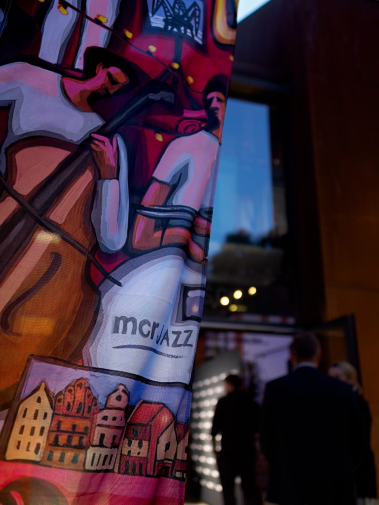
“MERCOR” S.A. Has Changed Its Name to mcr S.A. New Brand Identity Wins the Prestigious Red Dot Design Award 2026!
In the fire protection industry, red is almost the default colour. When designing our new brand, we deliberately chose to move away from it. Today, that decision has earned us… a red dot. The mcr visual identity has been honoured with the Red Dot Award: Brands & Communication Design 2026.
This distinction is particularly meaningful to us, as the award-winning design accompanied one of the most important changes in our company’s history – “MERCOR” S.A. changed its name to mcr S.A.
mcr – a new name and brand, nearly 40 years of experience
The change of name and visual identity did not mark the creation of a new company. mcr S.A. continues the business and legacy of “MERCOR” S.A., a Polish company with nearly four decades of experience in fire protection.
We remain the same organisation, built on the expertise of our people, our engineering and manufacturing capabilities, and long-standing relationships with customers and business partners.
At the same time, our new brand allows us to communicate more clearly what mcr represents today: a Polish technology group developing comprehensive fire protection and building safety solutions in Poland and across international markets.
The mcr Group brings together specialised companies, centres of competence and manufacturing facilities in Poland, Spain and Hungary. Together, we develop an ecosystem of safety technologies encompassing passive fire protection, active fire suppression systems, fire compartmentation, and the integration and digital management of building safety systems.
A Brand Identity That Reflects Our Direction
Creating the new brand was about much more than changing a logo or colour palette. Our ambition was to develop a consistent visual language for the entire Group – one that reflects our technological expertise, diverse capabilities and international ambitions.
We deliberately moved away from red, a colour so strongly associated with the fire protection industry. We wanted an identity that would not define mcr solely through a single product category, but would communicate a broader perspective: engineering, technology and safety.
The new identity was developed in collaboration with Dragon Rouge. It was the result of a shared effort to connect the heritage of an established company with the direction in which the entire Group is evolving.
Red Dot Award 2026 for the mcr Brand
Red Dot Award: Brands & Communication Design is an international competition recognising excellence in branding, communication and design.
Receiving this distinction for the mcr visual identity is an important acknowledgement of the direction we have taken. It demonstrates that a transformation driven primarily by strategic and business considerations has also resulted in an internationally recognised communication design.
We would like to thank the entire Dragon Rouge team for their creativity, courage, collaborative approach and attention to every detail.
Evolving While Staying True to What Matters Most
The new mcr brand brings together two essential aspects of our identity: the continuity of nearly four decades of experience built by “MERCOR” S.A. and our ambition to keep advancing safety technologies.
Our name, logo and colours have changed. The foundations of our business have not – our people, expertise, sense of responsibility and commitment to developing better solutions.
The Red Dot Award 2026 is a source of pride. Above all, however, we are pleased that our new brand increasingly reflects who we are and where we are heading.
mcr. Technology for a Safe Tomorrow.